

Canvas Apps Components
Components are reusable building blocks for canvas apps so that app makers can create custom controls to use inside an app. When developers start from the blank canvas they can create components that can define the characteristics of the app’s screen elements. A component can be a form, a button, a text box, they can become reusable on multiple screens. Components in Power Apps function consist of multiple attributes that users can apply in one step.
In this post, I will create a simple component. I will build a text header that we can later pin to other screens and uses in different applications. It will be a local component. Local means that I have to create w single components in a single app. If I was inserted this local component into different apps, I would have only a copy of this component. Component libraries are the recommended way to reuse components across the apps. When using a component library, an app maintains dependencies on the components it uses. To use the components from the component library, you must create an app that uses the component library.
I think it’s good for the beginning defined features of good components. Because the attribute of a good component in PowerApps is not only that it exists, but should certain some functions.
Attributes of a good component:
- possibility to pin it to new screens,
- using it in new applications with a similar control panel,
- should adapt in size to each new screen,
- can be reused by changing the attribute, the background colour, size, ability to attach some photo etc.,
- the ability to attach a photo.
- can be added to a new custom property.
Components have also limitations. Below you find the limitations components list. All this list you can find on Microsoft’s doc site: Known limitation.
Limitations of components:
- You can’t save data sources, forms, and data tables with components.
- Collections in components are not supported.
- You can’t insert a component into a gallery or a form.
- A master instance of a component is a local master and scoped to the app. If you change a master instance, only copies of the component within the app will reflect the change. Copies in other apps will remain the same unless you import the component library again. All master instances in those apps will be automatically detected and updated.
- You can’t package media files when you import a component.
- Components don’t support the Update context function, but you can create and update variables in a component by using the Set function. The scope of these variables is limited to the component, but you can access them from outside the component through custom output properties.
How to start
This is the part of the post where we start creating a new component
In the beginning, I’ve created a new application in PowerApps. I will pick the tablet layout component. Remember when you once choose what kind o layout you want you will not have the possibility of changing them during creating a component, also you can only use this component in other apps about the same layout.
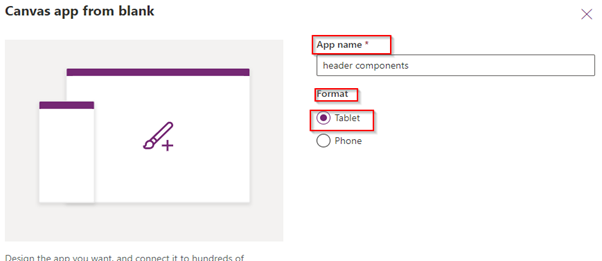
Canvas app from a blank
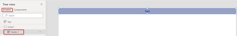
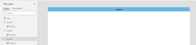
When our application is open, and we named it, you can see on the Tree view two things: screens and components. By clicking Components you can create a new component, which will be accessible to any screen in the app.
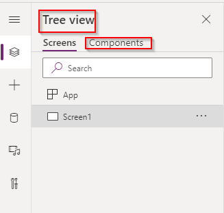
Tree View
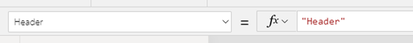
We choose Components (1) and click+ which means you want to create a new component (2). After click on this, you will see a new blank canvas – here we will create a component. Don’t forget to name your component. I’ve named mine: Header.
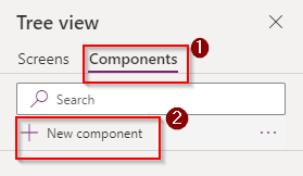
Create a new component
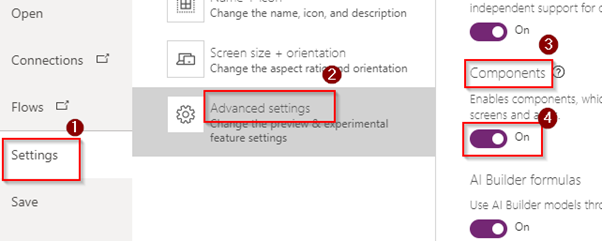
Tips: Probably if you have existing applications you can’t see this component on the left side – you should turn on your components. To do this you go to the settings (1) -> advance setting(2) and there find components (3) and turn them on (4).
When we have the first steps behind us, we can build the component now.
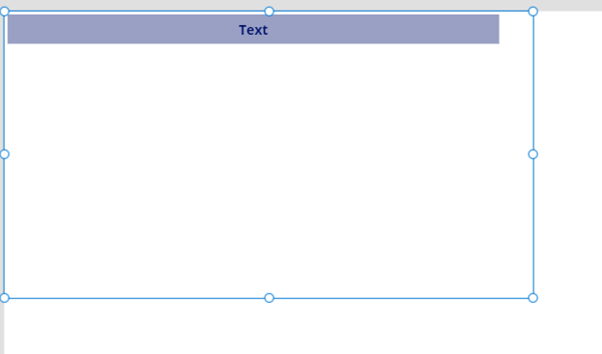
After these steps, I’ve clicked in insert label and drag this across the size. After that, our components will be put on the canvas – picture (2).
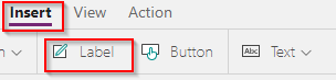
Step to insert label.
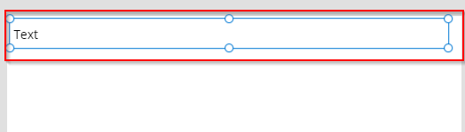
Put the components on the canvas.
Next, I go to Home on the ribbon and there I can edit my component a little – set the inscription in the middle, add a colour, etc.

Home – ribbon
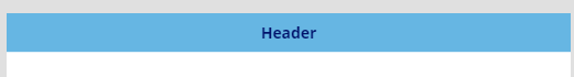
After this, the component looks just like that – I’ve changed the colours, size, and position of the text – just like in (Microsoft) Word, you can change the attributes of your components on the ribbon.
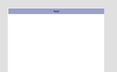
Edit component
Just like you can see, my header has got high and width. Because we chose the canvas option for the tablet, our components dimensions will have a suitable size for a tablet.
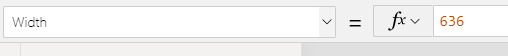
Component Width
Component Height.
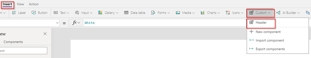
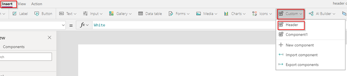
There we go… we add the components right to the screen. Just like you see the component not fit as well, it has its own high and width. If we create the component we want to insert them into the screen. In this case, we should back go to the screen on the Tree View, and there choose Insert after click custom. You see there is a list. You can import them or export them to other apps – in the first place will be a component that you created. Now, only what you should do is click on them.
Add components to the screen
There we go… we added the components right to the screen. The component is not fit as well – I can drag them around, but it doesn’t fit the size of our screen and it has its own high and width. So, now I have to adjust the dimensions of this component then it will fit my screen. To do this I’ve backed to the component from the screen and use an object in Powers Apps called App.ActiveScreen. Apps.ActiveScreen means a component that “knows” the screen where the current component will be placed. In the first step, I go to the label and enter the formula App.ActiveScreen.Width at the moment my components will automatically adjust to the screen width.
App.ActiveScreen.Width
When setting the height of the component, I also enter the same formula, with the difference that in the object I mention Height and in the formula, I only replace the word: App.ActiveScreen.Height
App.ActiveScree.Height
I can add another screen in the same application but my header should be got the same colour and size just like my master components. To do this I go to label and enter the formula:
Parent.Width,
Parent.Height,
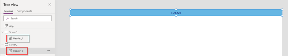
So that my components will automatically adjust to the width of the screen, and that every change contained in it appears on the other screens. When we apply this formula and when we go back to our screen, we will see that we can move our header to the right width and it will fit perfectly with another screen. This component can be reused on other screens in my apps. For example, if I’ve changed the colour background in my main chooses component on the other screen colour components will be changed.
Adjust component to the screen.
To add this component to other screens in the screen click a Home -> New screen -> choose blank screen
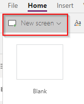
After this step, you will create a new blank screen where you can add your components to this screen.
Insert component to a new screen.
Just like you can see, components have te same size, colour, height as the main component.
Adjust the size colour component.
Now, we know how to change the width, the height of our components. So in another part of this post, I will describe how to add this component to custom properties.
Custom properties
Custom properties are the advance customizations provided by the PowerApps. A component can receive input values and emit data if you create one or more custom properties.
We have two types of custom properties:
Input property is how a component receives data to be used in the component. Input properties appear in the Properties tab of the right-hand pane if an instance of the component is selected.
Output data is usual for emitting data. It will take out from the component and gave it back to called screen. When you create an output property, you can determine what other controls can refer to the component state.
Custom properties are located on the right panel, they appear when we click on our components. After clicking on it, you will see a panel on the right with options to create properties:
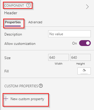
New custom property
When we click + New custom property here you can create input properties and output.
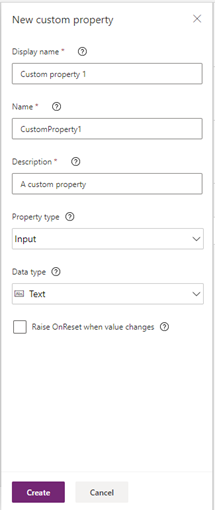
Add a new custom property.
You can choose a specific type of data that will be selected for a specific component. In this scenario, I choose Input and data type Text – depending on your needs, you can choose a different type of data.
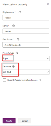
Type property
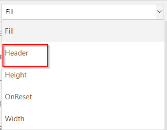
After this step, we can see a new property in the right corner.
Remember to name properties and in the Name window so that there are no spaces when entering the name.
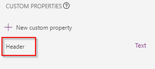
Then the name of the properties will appear at the bottom of the right pane. To add this new property to our label, we need to change to components before Text – enter the name of our components, then go to the label and change the title of our components there. I must enter the following formula; Header.Header, you can see that the name of the new components shows our custom properties.
I’ve changed the default header:
Because my label without the components is hardcoded, I want to put it into the property. To do that I must write the name of my components and name my property. After this, you will see that component change the name everywhere from Text on Header.
This way all remaining screens will have our header text. We can change the name of our component by typing in the right panel a new name for each screen.
This component can be reused on other screens in my apps. For example, if I’ve changed the colour background in my main chooses component on the other screen colour components will be changed.
Components in Power Apps can consist of multiple attributes that users can apply in one step. Components can simplify your work with Power Apps. Thanks to them, we can create characteristics buttons, shape, colours. We can reuse them in other apps, which help us to save our time and unifies our apps.
About author

You might also like

Database projects with SQL Server Data Tools (SSDT)
Last Year (2021) I released a full and comprehensive course about SSDT: developing and maintenance SQL Server database within SQL Server Data Tools in Visual Studio. Thank you to all

Humans and AI: How to find the right balance
When companies decide to implement AI tools, the main argument is usually that AI will act as an employee assistant – helping people work faster and better. On paper, it

Last Weeks Reading (2023-11-05)
📰 News Process Azure Event Hubs data using Azure Data Factory Mapping Data Flows Read how to process Azure Event Hubs data using ADF for certain use cases. Automate a


0 Comments
No Comments Yet!
You can be first to comment this post!